Hero Component
Background color or image with opacity. Text floated left, center or right. Call to Action button
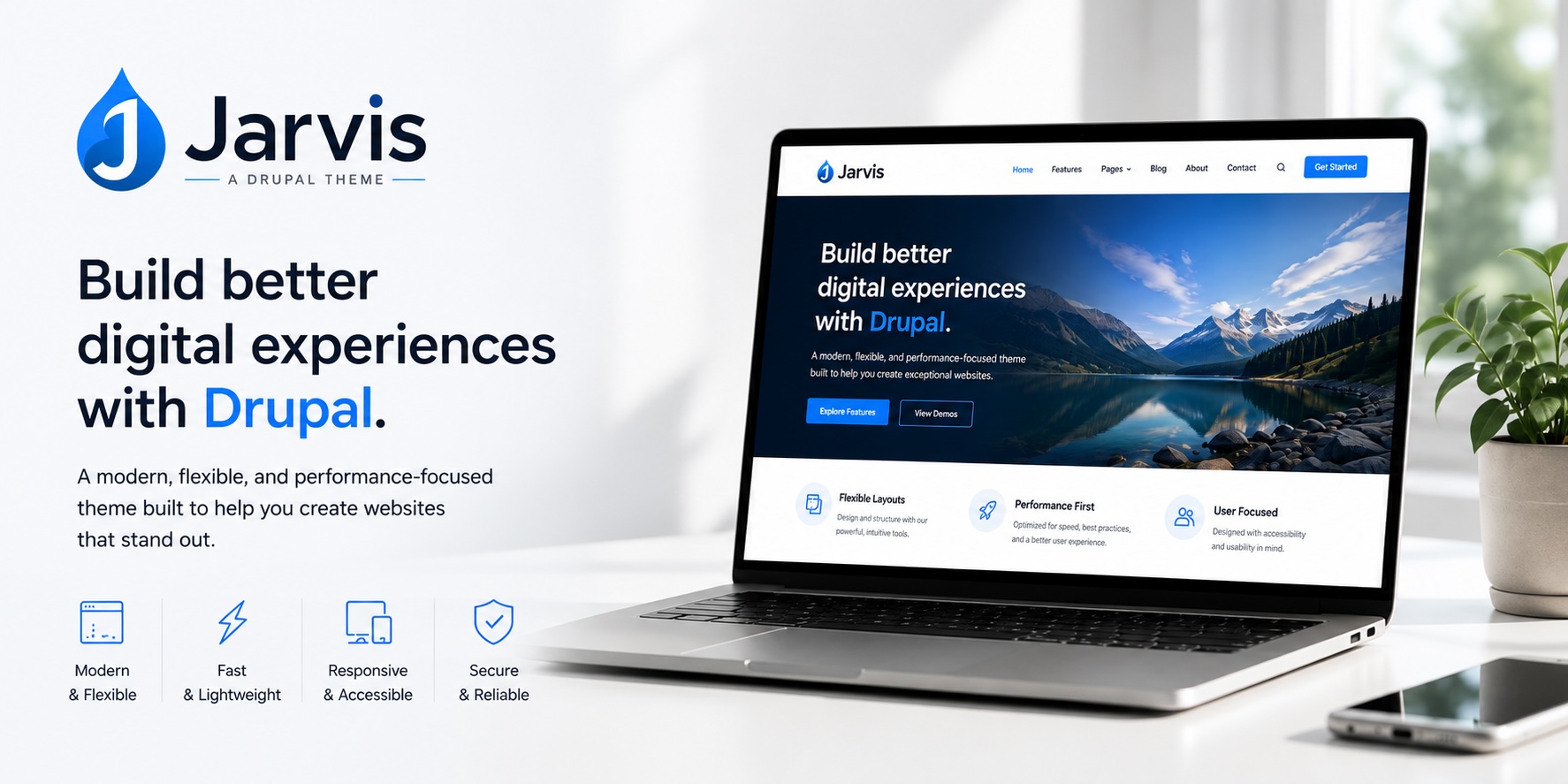
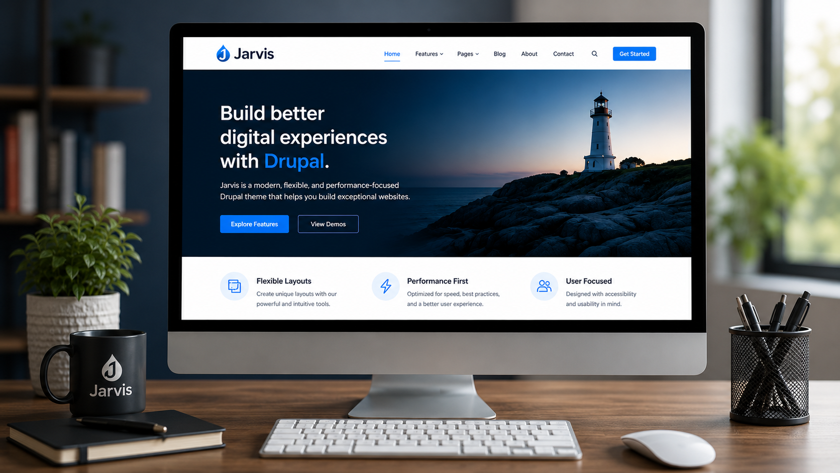
Jarvis — the flexible SDC theme for Drupal
Build faster with a modern Single Directory Components (SDC) foundation, production-ready components, and layout freedom that scales from landing pages to full sites.
Get This ThemeVideo Components
- Video Background with text overlay
- Full width video
- Video with a Sidebar
Testing the Video Background
Try it today!
Request InfoCard Components
Card blocks with multiple options
Jarvis is designed for teams who want a clean SDC workflow, a library of reusable UI building blocks, and the freedom to compose pages in Layout Builder/Canvas without fighting the theme.

SDC-based by design
Markup, styles, and schemas together in Single Directory Components. Predictable, maintainable, and friendly to both developers and site builders.

SDC-based by design
Organize markup, styles, and schemas together in Single Directory Components. Predictable, maintainable, and friendly to both developers and site builders.

Layout freedom
Boxed or full-width sections, responsive columns, and flexible content patterns that look great on any device — no custom templates required.
Jarvis ships with a focused set of 20 components that cover the most common marketing and editorial patterns — so you can assemble pages quickly and keep designs consistent.
This component uses the WYSIWYG editor in Canvas (this is custom - Canvas doesn't support the editor out-of-the-box).
Take the Drupal AI course - for FREE.
An introduction to Drupal AI by Rod Martin
Section heading
Body copy with rich text support.
This card expands the image to the full height of the container regardless of how much text is in this component.
Compose pages from sections and responsive column components. Keep content editors productive and ensure the design system stays consistent across every page.
People Cards
Image, name, contact information and socials


Stats Card Component
Components included for modern marketing and editorial pages
Responsive column layouts you can mix and match in minutes
Component architecture that makes theming and reuse straightforward
Image with Overlay
Overlay can be left or right justified
Come as you are —

Make it yours: theming and customization
Jarvis is built to be customized. Adjust look and feel through component props, theme settings, and SDC overrides — without losing the benefits of a consistent system.
- Swap section backgrounds and spacing per page
- Choose component variants (cards, columns, CTAs)
- Extend the library with your own SDC components
Trusted by people who value speed and consistency
When the design system is component-first, we move faster — with fewer regressions and more predictable results.
Large Call to Action Component
Get Jarvis
Build your next Drupal site with Jarvis
Start with a flexible SDC foundation, leverage 20 included components, and ship pages that look consistent across every breakpoint.
Map Component
Google map from an address - no API calls